
Employee Training | Bambee
Small business owners need different training to keep their employee safe and compliant. Bambee Training Portal enables them to purchase and manage training courses.

Project Date
Oct 2022
Duration
3 months (from initial ideas to dev start)
Company
Bambee
My Role
Lead Designer
The Team
Collaborated with a product manager and engineers
Challenge
The experience of buying and selling training courses were both fragmented. Customers and their employees could only take 4 courses on our website, if they bought other courses, they needed use a link to access a different platform
It wasn't a streamlined process for our sales team as well. A sales rep normally spend 15 mins (sometimes up to 30 mins ) on setting up training courses for a new customer. They need to created a case in Salesforce, manually bill, and send out an email with a temporary link…
So how might we build new features that enable sales reps to sell training on the fly, meanwhile, customers can easily manage and employees can watch training courses?
Results
We added two features on two platforms, one platform is used by our internal teams called Honey, the other is a web app facing customers and their employees.
The net MRR Growth Rate has achieved 26% in MRR growth. How did we make it? Let me share the story with you.
Monthly Recurring Revenue (MRR)
26%
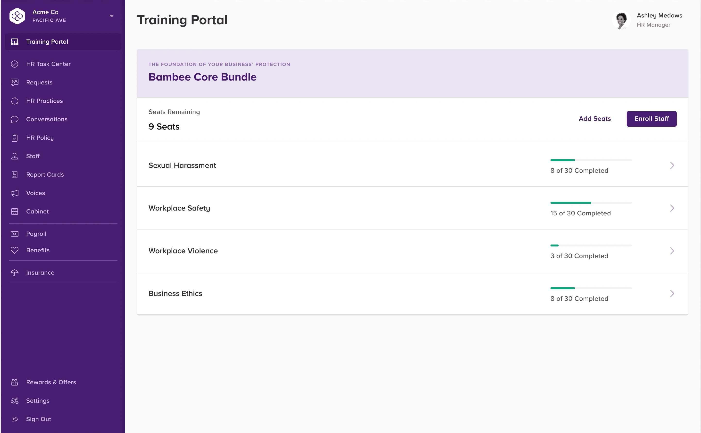
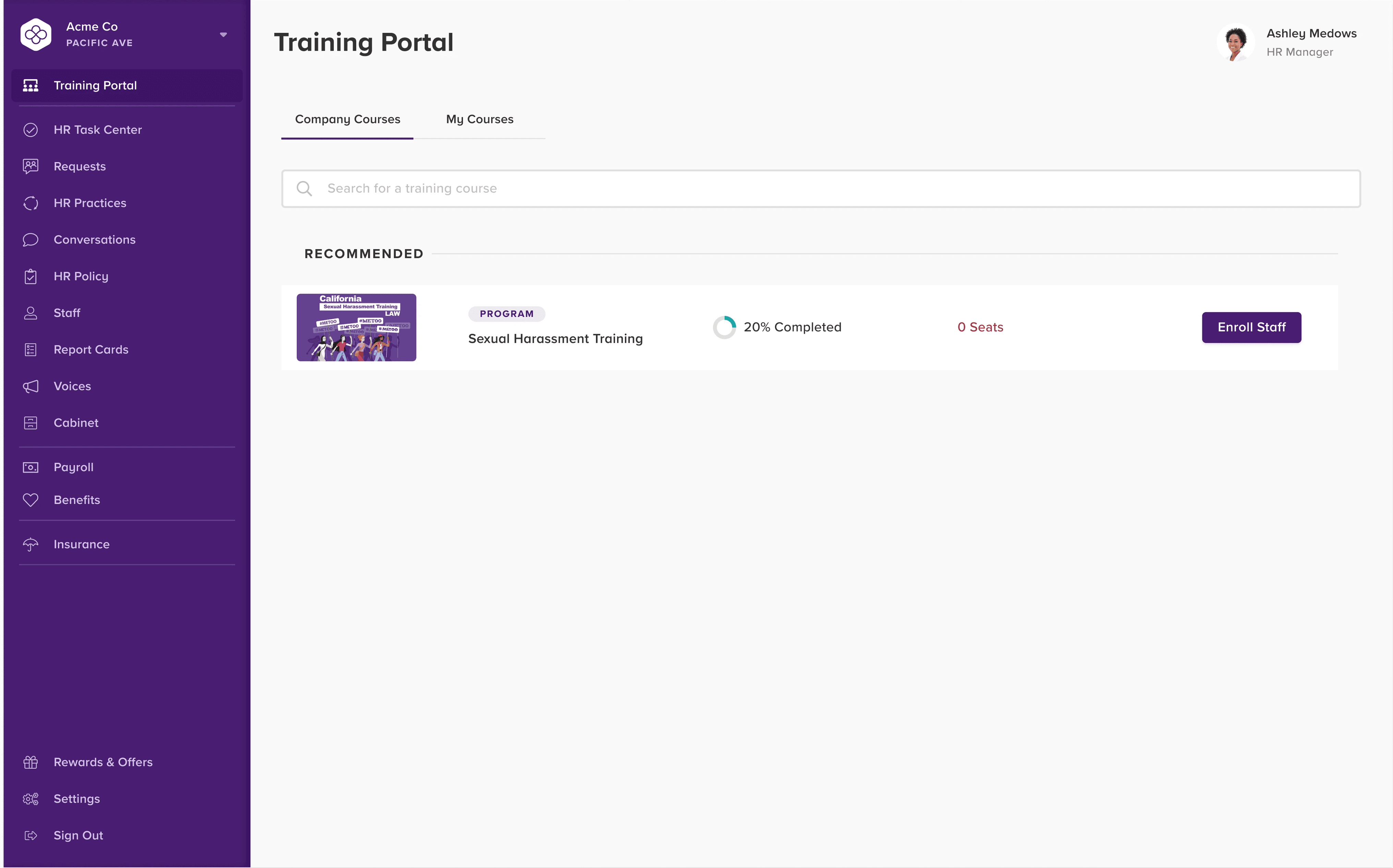
Training is in high demand by our customers. Most of them are small business owners, don’t have much HR resources, but they have awareness to keep HR compliant. Training courses like Sexual Harassment, Workplace Safety, Preventing Workplace Violence can help them educate their employees, create a safe work environment and drastically reduce potential risks.
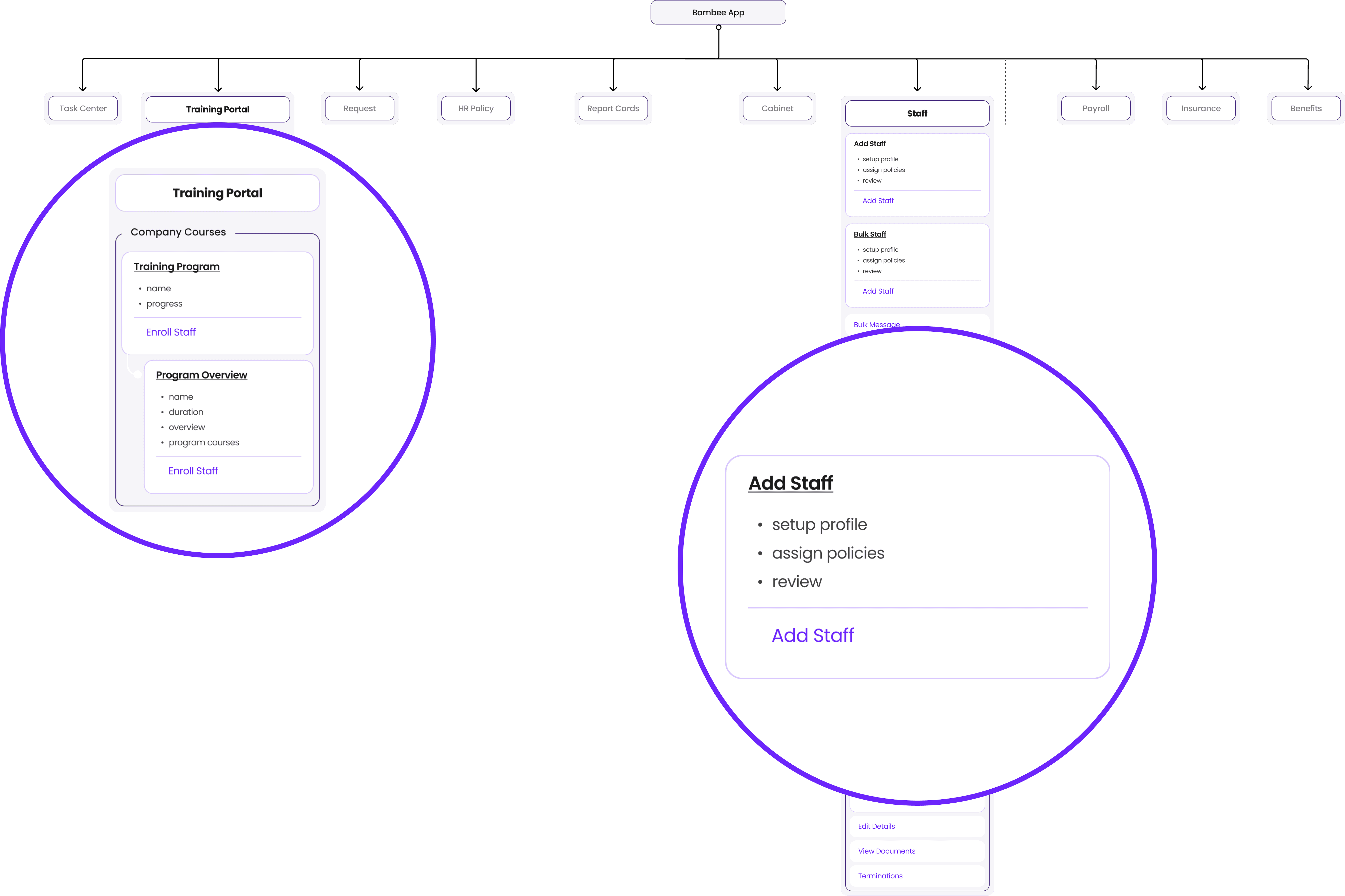
Before we dive in, let me briefly explain the structure of our product.
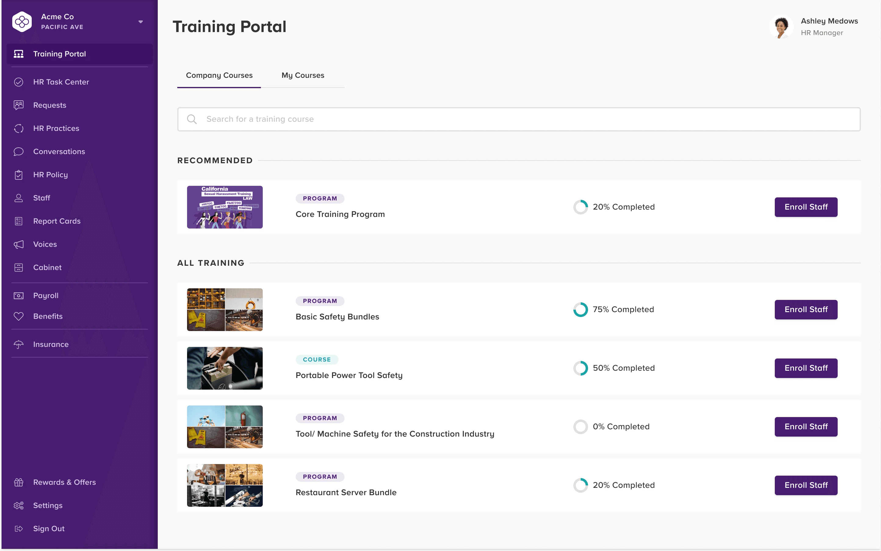
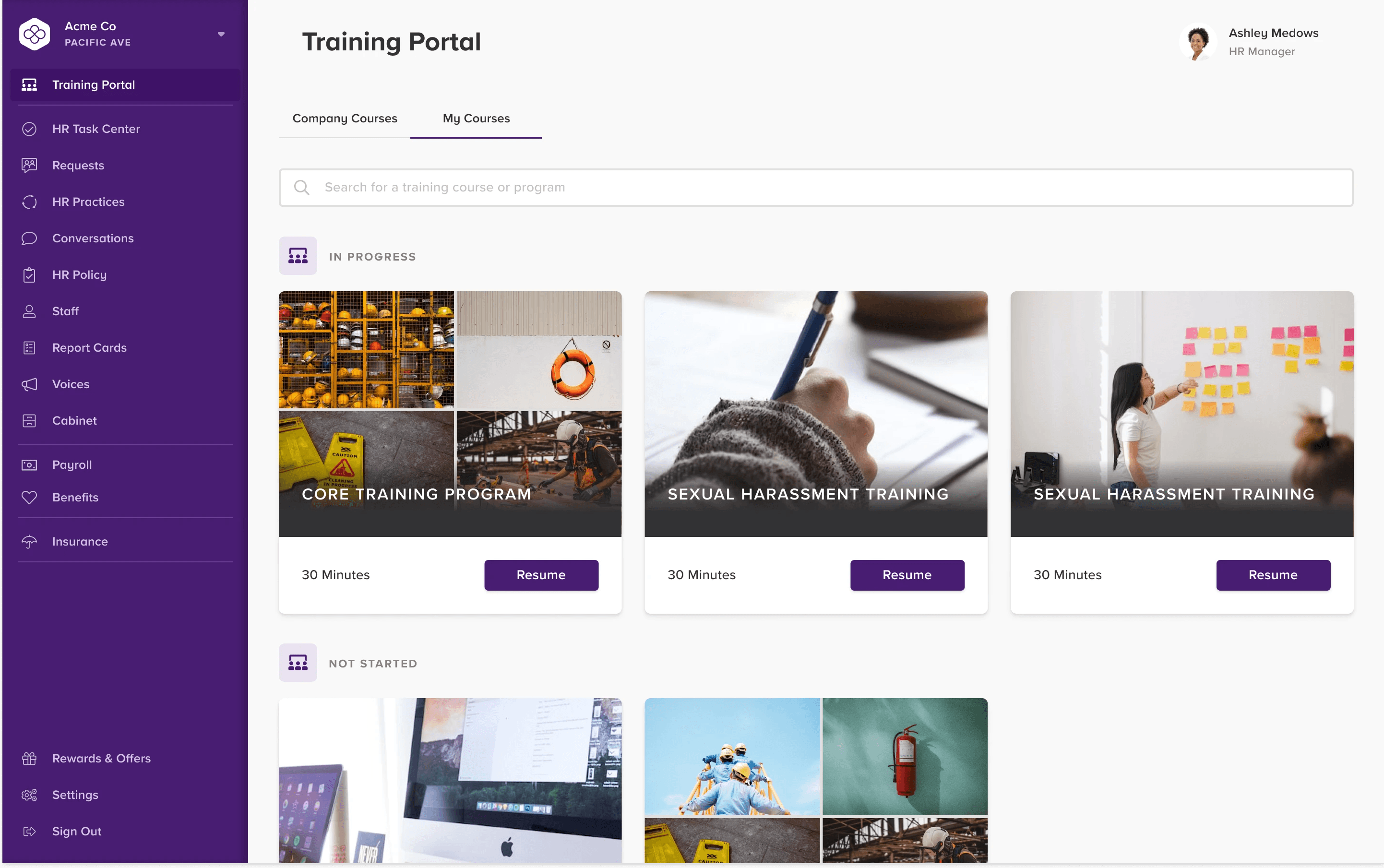
Customer approaches training by either Training Portal or Staff - Add Staff.
Honey
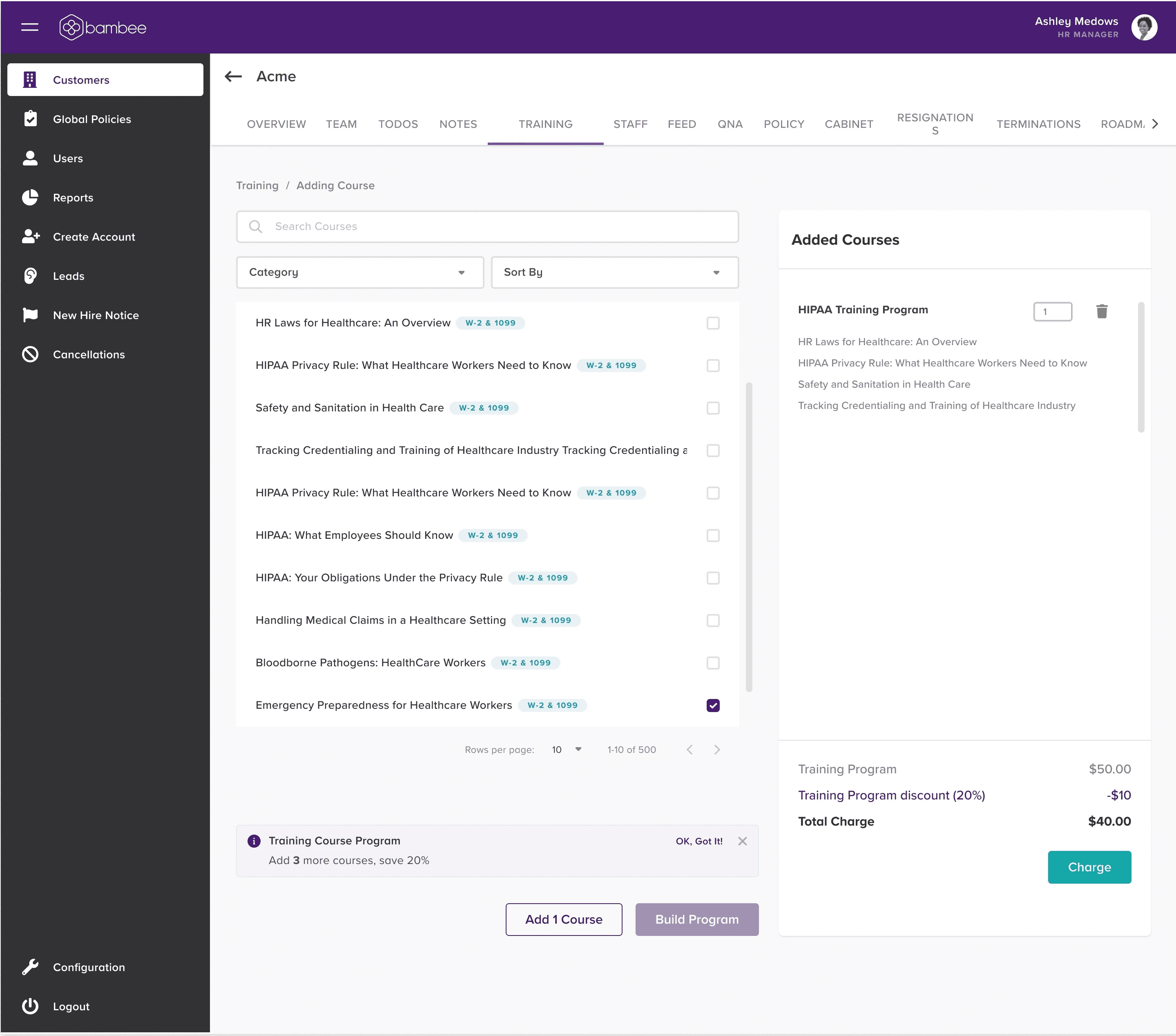
The function on Honey was very limited. Sales rep could only sell seats of the Core Training Bundle. If they wanted to sell other courses, they had to create a case in Salesforce, manually bill customers and then send out the course link.

The function on Honey was very limited. Sales rep could only sell seats of the Core Training Bundle. If they wanted to sell other courses, they had to create a case in Salesforce, manually bill customers and then send out the course link.
The function on Honey was very limited. Sales rep could only sell seats of the Core Training Bundle. If they wanted to sell other courses, they had to create a case in Salesforce, manually bill customers and then send out the course link.
One sales rep told me that before calling a client, he would open Honey, take a look at staff roles of this company, then recommend related training courses to his client.
Normally sales reps would sell the preset bundle, but if the client had a different need, they would also customize the bundle for customers.
A key challenge sales reps are facing is that they have to do everything on the phone, so they need this new feature to be flexible and easy to use.
Sales reps can use search or category to quickly locate the training they are looking for. An info banner shows how much money they can save for their customer, thus encouraging their customers to buy at least four courses.
* In the MVP, we only focused on upload all training courses to the platform, the next milestone will be adding pre-packed training programs.

View Information
When sales reps build a program, program details will pop up on the right side. They can browse courses info and the price details all at once, so they can easily communicate with their clients.
* It’s an internal team tool, so I didn’t spend much time on the visual design.
First Iteration of Training Portal
Why "Add Seats" Button?
The original design provided users with two actions, Enroll and Add Seats, so I continued the design. But I felt something was not quite right. Why would someone buy training seats but not assign them?
Obviously most employers wouldn’t do that, cause in that case they had to pay for the vacant seats. So I rearranged the design, surfaced customers with only one Enroll button.
Therefore, employers/ admins will enroll employees first, then pay for needed seats.
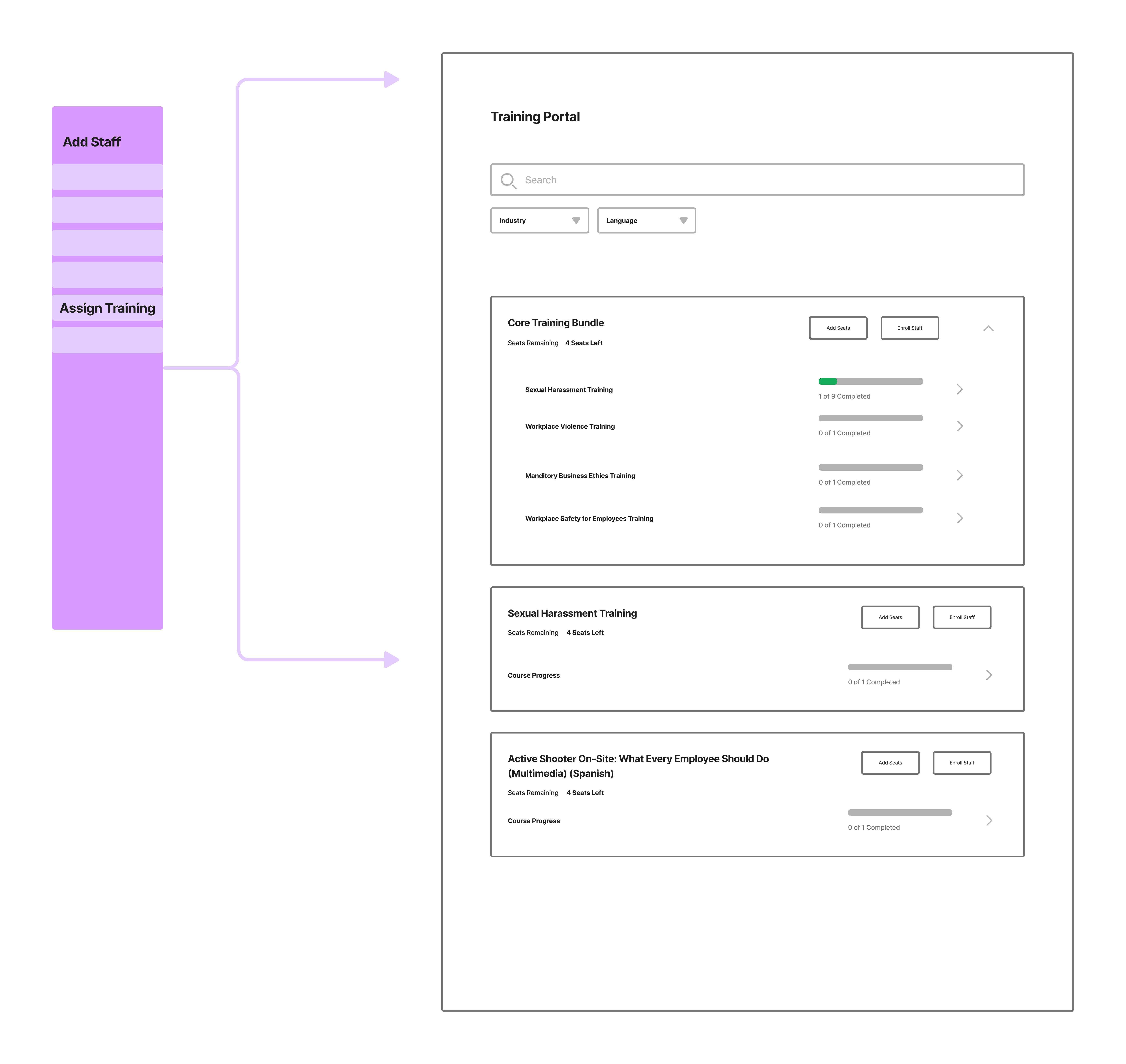
Before
After
Which is easier to parse information?
Another interesting thing I noticed after talking to sales reps was that not only employees need to take training courses, employers or admins also need to do that.
I explored several ideas of the layout, finally moved forward with the View Mode. The first reason here was to differentiate this screen from the Course Management Screen. Plus, the bigger thumbnail here can easily catch users attention, help them make decisions.
Version A: List

Version B: View Mode
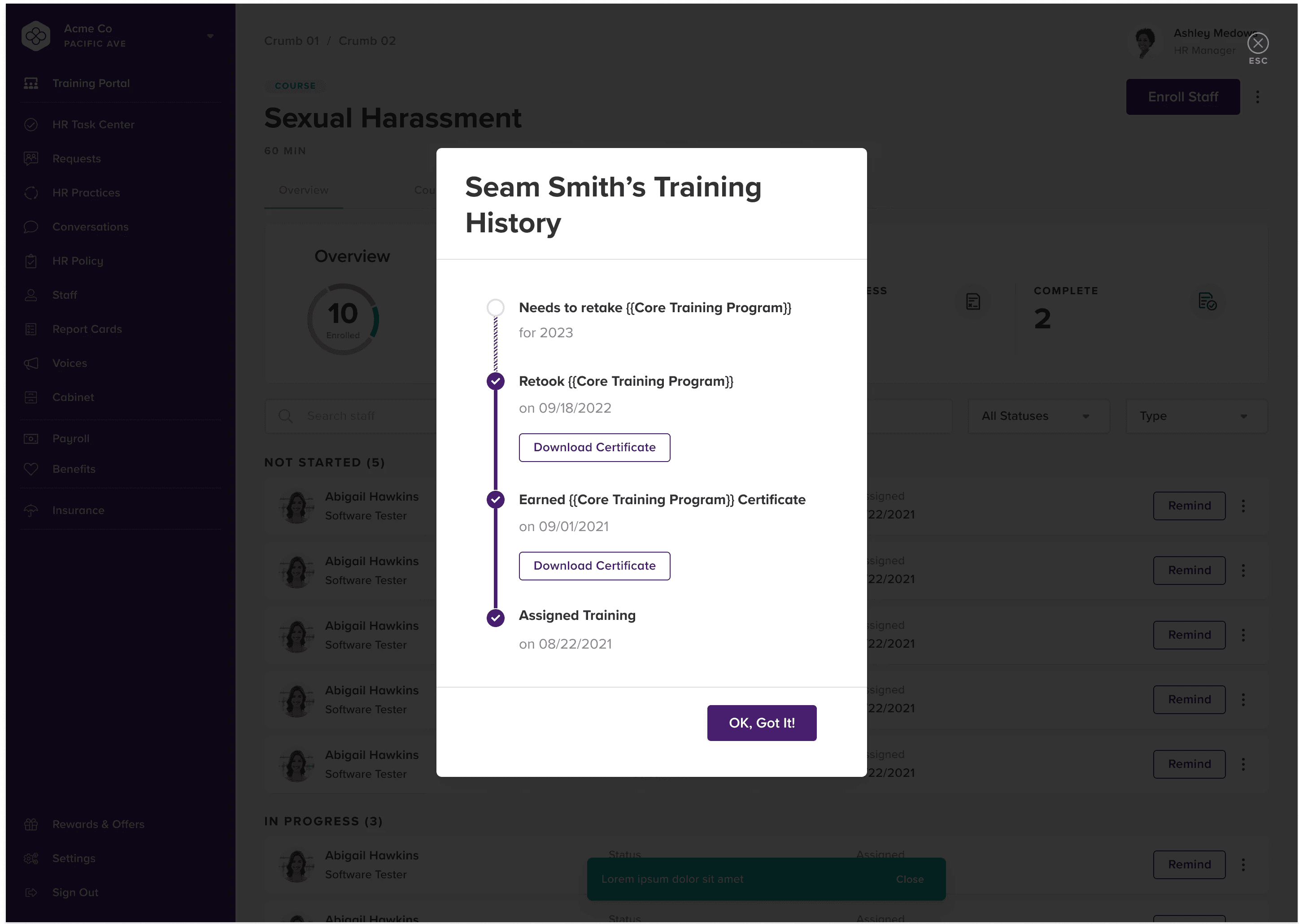
One main product validation metric we used at Bambee is LTV/CAC, which means when customer acquisition cost remains the same, we hope the lifetime value per customer can be as much as possible, so the third milestone was designing recurring training.
Task Center Notification
When a training course has been taken over 1 year, this card will pop up in the task center, and send out an email to notify both employers and employees that this employee needs to retake the training now.


Result and Reflection
The net MRR Growth Rate has achieved 26% in MRR growth. How did we make it? Let me share the story with you.
The architecture of Honey didn’t follow usability conventions, which caused a lot of limitations
Even though I tried my best to collect information from experts. I still believe user research is necessary